 The journey of SEO transformation is based on more than ten years. However, the major changes have occurred in the recent years, especially due to the rise of mobile internet. Nevertheless, there have been issues in the mobile internet. For instance, it has been a general case scenario that people would search for particular items on their mobiles. They would get the results in the form of text but there wouldn’t be any images with the search results.
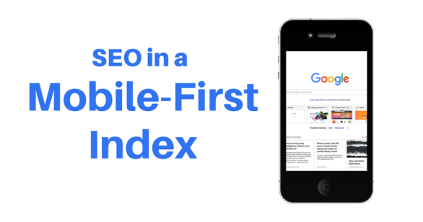
To fix this issue, Google is going to give preference to the mobile searches. This preference is commonly regarded as ‘mobile-first index’. It means that websites are now going to be indexed primarily based on their performance in the mobile browsers. The mobile sites, which will respond well in mobile browsers, will definitely perform well in the desktop browsers. Hence, other ranking criteria for the websites are likely to be the same. The major decisive factor in this regard would be the website’s performance in the mobile, given that the website qualifies in all other criteria.
So, what kinds of websites are going to take a beating?
If your mobile website fails to show synchronization with the desktop version from the perspective of content and structure, you are likely to witness your website getting dropped in search engine ranks. Another case is that the mobile websites change the good structure of mobile website into the bad one.
The best practice in this regard is to work on a responsive website design. In that case, you will not have to work on creating more than one version of the website. However, you will have to make sure that your website is being responsively adjusting itself according to the size of screen it is being opened in. t is perhaps one of the main recommendations according to mobile-first Indianapolis SEO guidelines.
SEO tips for mobile-first index
- To make proper analysis, plug your website for a Google mobile-friendly test. To start this test in a better way, first plug your key pages in the console. It may be a little time consuming but it would still be way better than knowing after half a year that your website’s main pages weren’t properly optimized for mobile search. If your page or pages fail to pass that test, you can check AMP guidelines to make your website responsive according to the recommendations.
- Sometimes, Google doesn’t index the website’s pages. To check whether your website is indexed or not is type ‘site:mywebsite.com’ in the URL field. If nothings show, your website has not been indexed. The major reason could be that your website has two versions for both desktop and mobile. It has been noticed many times that site owners or developers do not pay attention to a sitemap file on mobile version. This small mistake is usually the biggest reason for mobile version not being indexed. Create a sitemap file and add it in your SEO campaign to get your pages indexed.
- It’s important check the mobile version of your website for errors using Google Search console. To check for errors, you can go to Google Search Console > Crawl Errors > Smartphone Errors. There could be any result such as broken links, faulty redirects and many more. Based on the type of error, make correction.
 Wade A. Nunez